Learn About Auto Layout for Xcode 5 and Interface Builder
/When we design an iPhone/iPad app, the positions of the buttons, images, and text fields is called layout. Apple created Auto Layout to help automate the process of positioning our user interface (UI) elements, and to reduce the amount of code we write.
Xcode’s Interface Builder is a great tool to quickly layout your user interface for your iPhone or iPad app. The way it works has changed from Xcode 4 and I'm going to explain how it works in Xcode 5.
No Automatic Layout Constraints in Xcode 5
In Xcode 5, when you first design your iPhone interface there are no automatically generated layout constraints (blue barbells). In Xcode 4 after dragging a button onto the canvas the layout constraints (blue barbells) appeared around the button. The layout constraints snapped to the closest edges and changed every time you moved a button or label. The feature was suppose to be helpful in setting up layout constraints, but it was problematic and made layout very, very frustrating.
New Xcode 5 Behavior
The Xcode 5 layout setup and behavior has changed for the better. It's easier to use after you understand how it currently works. Layout can be one of the most frustrating things, and layout on Xcode 5 is a lot less frustrating. When you position a button you won't see the layout constraints (blue barbells) immediately. The initial placement of views, buttons, and images will match what you see on the iPhone.
Auto Layout Constraints in Xcode 5 as blue barbells
Running the iPhone App with Initial Drag-and-Drop Placement
If you run the iPhone app with the new buttons you dragged onto the screen, everything will appear exactly as you placed it. Imagine a push-pin in the top left corner of every button or text field. That push-pin holds the button on the iPhone app, until you explicitly tell Xcode to move it. The same concept applies to dimensions (sizes), both the width and the height you set will match what you see on the iPhone simulator.
Layout Constraints Need to Describe Position and Size
Layout is describes where something will appear and how big it will be. A button can be 80 x 40 points big and with it's top left corner at (x, y) coordinate (100, 100).
Auto Layout provides a lot of flexibility in how we can describe these attributes. We can describe position and size in relation to left, right, top, bottom of other user interface elements. Widths of different buttons in a game menu can be equal, and the buttons can be centered along the Y-axis (vertical axis) to create a single centered column layout. We can even make a profile image stick to the top left corner of the screen.
Conflicting Directions are Easy
It's possible to send conflicting directions with Auto Layout. As an example, if I told you to take a left down main street and a right down main street there are three outcomes. You might go left, right, or ask me for directions again. When Xcode is given conflicting directions it will make a decision to either go left or to go right. The same concept applies to position and size layout constraints. Xcode will try to layout your user interface, but if you provide conflicting constraints the app may look different every time you open it.
Points Not Pixels
We work with points when we describe layout. A button 100 pixels wide, on a non-retina iPad Mini (1024x768 pixels), would look twice as long as a button with a width of 100 pixels on a retina iPad Mini (2048x1536 pixels). If we tried to use pixels, we’d have to make special cases for retina and non-retina displays, which would add more code and potential bugs. To simplify the problem, Apple introduced points, which are related to pixels, but there is a scale factor. On a retina display in 2013 we can convert points to pixels using the scale factor of 2. On a non-retina display the scale factor is 1. Using points, a 100 point wide button would appear to be the same size visually. However, it would be 200 pixels wide on a retina screen and 100 pixels wide on a non-retina screen.
Layout Example
Let's make a button that is positioned relative to the edges of the iPhone. It will span the area 10 points from the left side to 10 points from the right side. The positional layout provides a flexible width. On a portrait iPhone 5 (568x320 points) that would make it 300 (320 - 10 - 10) points long. If you rotate the iPhone 5, you'd have a button that was 548 (568 - 10 - 10) points long. That works great!
Auto Layout Problems
Let's add a requirement from our artist. The button needs to be exactly 200 points long. If we combine this width constraint with our existing position constraints, we will have a conflict. Xcode isn't sure if the button should be on the left side, the right side, or if it should be bigger than 200 points long. The new width constraint conflicts with the left and right position constraints.
Auto Layout conflicts can cause unexpected behavior.
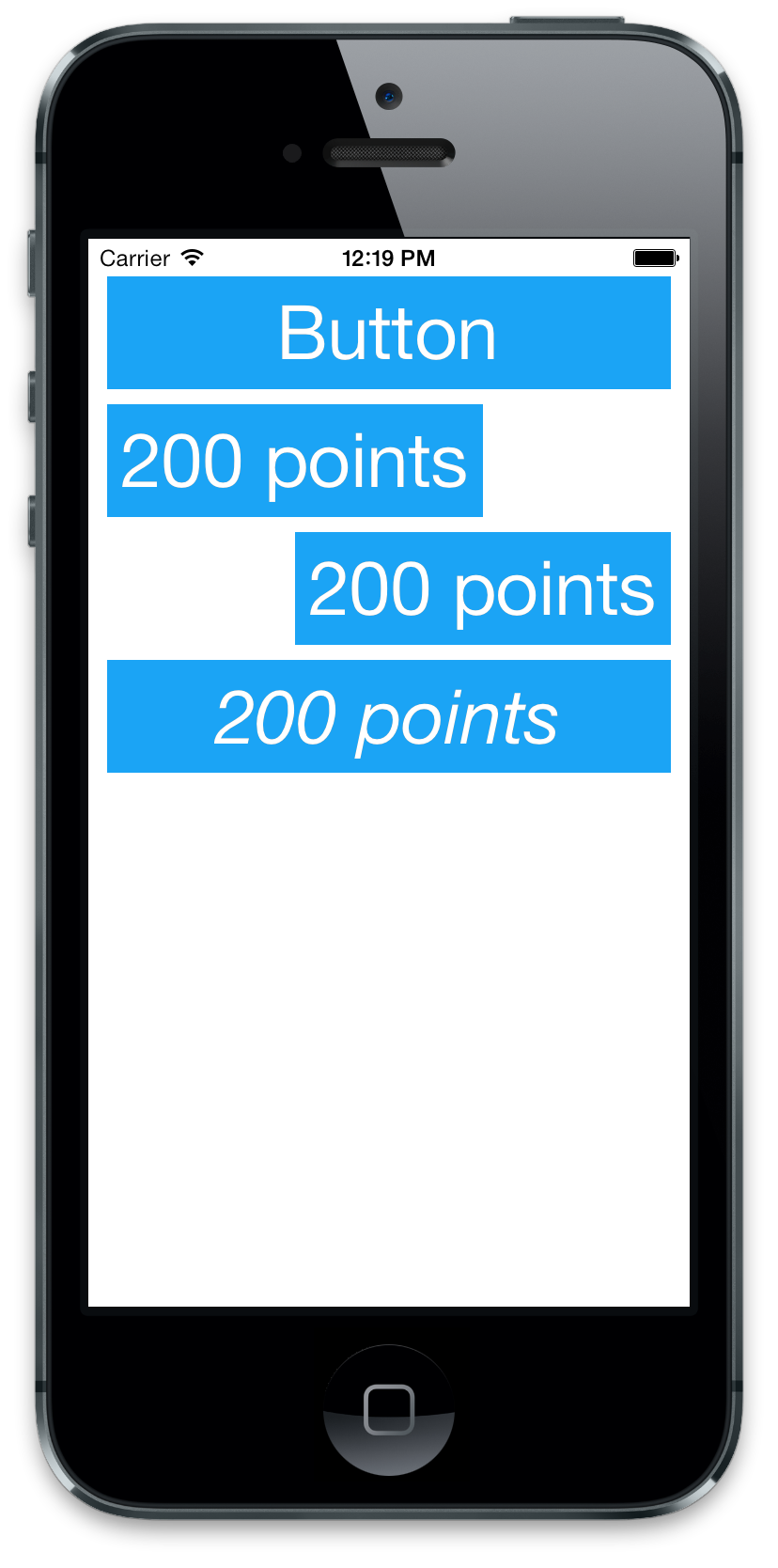
- The top button has 2 constraints, to hold it to the left and right edges. These position constraints also describe the width as 300 points.
- Adding an artists constraint for a button, forces a conflicting width constraint of 200 points.
- The bottom three buttons are what can happen when there is a conflict. The Auto Layout system will break one of the three constraints so that there is not a conflict.
- Breaking the constraint results in the button hugging the left side, the right side, or ignoring the width constraint (hugging both sides).
Rotating Auto Layout can expand or shrink buttons on iPhone
Ambiguous Layout
When we have a conflict of constraints we get unpredictable behavior in Xcode. The layout is called ambiguous since one of the constraints, or statements will need to be broken. That means that the buttons, views, or images will not appear where you want, and may change every time you run the iPhone app. Ambiguous layout is something we need to learn to avoid, and with a little practice you can avoid it.
Next Learn Practical Layout Examples
In my next post, I'll explain how to use Auto Layout to achieve various placements of images, buttons, and iPhone app UI.
Connect
- Join my iPhone newsletter to keep learning how to make iPhone apps.
- For more structured learning, signup for my online iPhone app course.


